App Design for Distributed Network Monitoring System
Before starting the design process, it is essential for me to understand the requirements and constraints of the project. This includes understanding the target audience, the features and functionality of the app, and the technical requirements of the system.
Michael has a proof of concept available on GitHub. My contribution to the project is to design the landing page, user interface, and user experience for the app. I am working closely with Michael to ensure that the design meets his vision and the technical requirements of the system and is intuitive and easy to use for the target audience.
I wanted to dig deeper on the problem and find answers to some questions before starting the design process. These questions include:
- What are the key features and functionality of the app?
- Who is the target audience for the app?
- What are the technical requirements of the system?
- What are the design constraints and limitations?
- What are users trying to accomplish with the app?
- Are there any solutions currently available solving the same problem?
Design Process
My design process has evolved over time as I embraced AI for more repetitive tasks and focused on creating a more intuitive and user-friendly interface. This new found leverage allows me to be free to focus more of my time exploring new design ideas and experimenting with different approaches.
In my personal view, the Product Designer role is changing rapidly, and it is essential that my skills and knowledge also evolve. I’ve decided to leverage my knowledge of HTML, CSS, and JavaScript to create a responsive and accessible prototype that goes beyond what I coudlv’e done with Figma alone.
One of the benefits of working in open source companies/projects is the access to a vast community of users who can provide feedback and suggestions. It will be interesting to see how the community responds to the prototype and what suggestions they have for improvement.
I broke down the problem into phases and created a detailed plan for each phase.
Phase 1: Foundational Requirements and Information Gathering
Goal: Establish a clear understanding of the core needs and constraints for the dashboard in its early stage.
- What’s the typical daily workflows and critical information needs of a DevOps or SRE professional using the tool?
- What are the absolute essential pieces of information or functionalities that this tool currently provides?
- Considering that this project is in its early stages, what types of new data or functionalities do we anticipate being added in the near future?
- How might the initial dashboard design accommodate this growth?
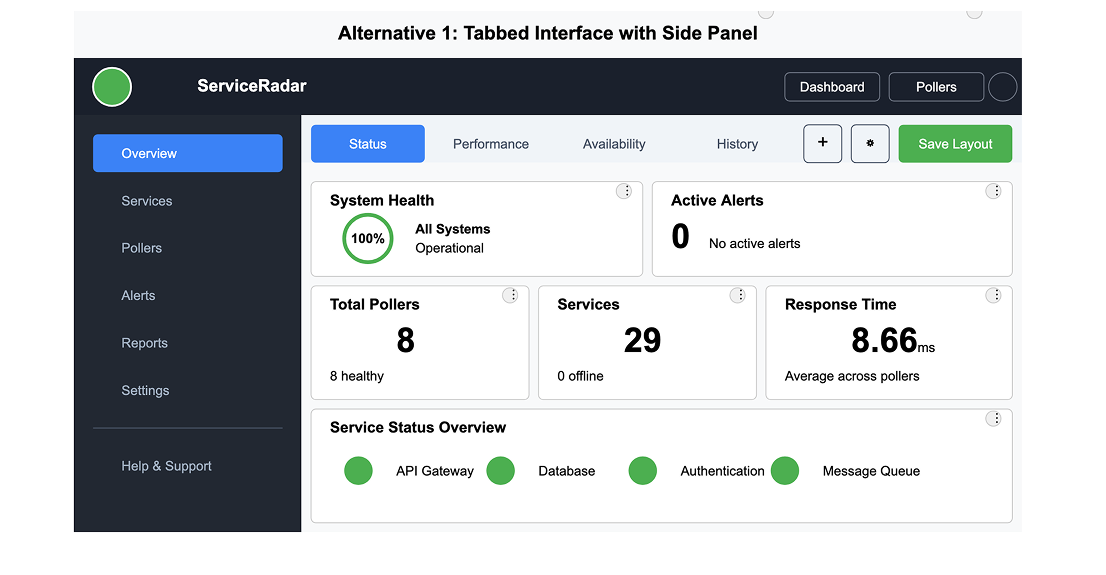
Phase 2: Information Architecture - Initial Structure & Navigation
Goal: Define the high-level structure and navigation of the dashboard, considering the limited initial content and potential future expansion.
- Define the high-level structure and navigation of the dashboard, considering the limited initial content and potential future expansion.
- What would be the most logical and essential top-level navigation items for this tool?
- For each of the top-level navigation items suggested, what initial groupings of information or widgets would be most relevant and provide immediate value to the user?
- Considering the target audience, what are some common and effective navigation patterns that would be intuitive for DevOps and SRE professionals?
- Are there any immediate ‘quick actions’ or shortcuts that would be beneficial for users to access directly from the main dashboard view in this early stage (e.g., viewing all pollers, checking alert status)?
Phase 3: Layout and Basic Element Definition
Goal: Establish the foundational layout and identify key visual elements for the dashboard.
- Where should I place the top-level navigation, key status indicators, and the initial information groupings identified in Phase 2?
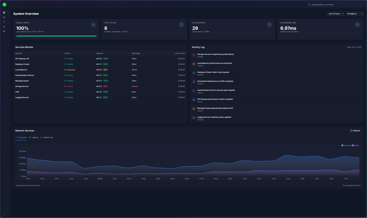
- Based on the core functionalities, what are the 2-3 most critical ‘at-a-glance’ status indicators that should be prominently displayed on the main dashboard view?
- How can visual hierarchy be used in the layout to draw the user’s attention to the most important information first, given the limited initial content?
- Even in the early stages, should there be any initial considerations for how the dashboard might adapt to different screen sizes or devices?
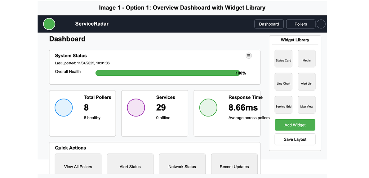
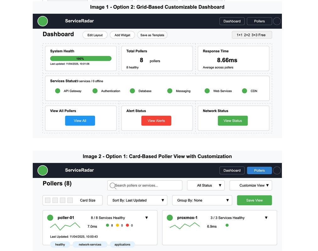
Exploration of layout and basic element definition
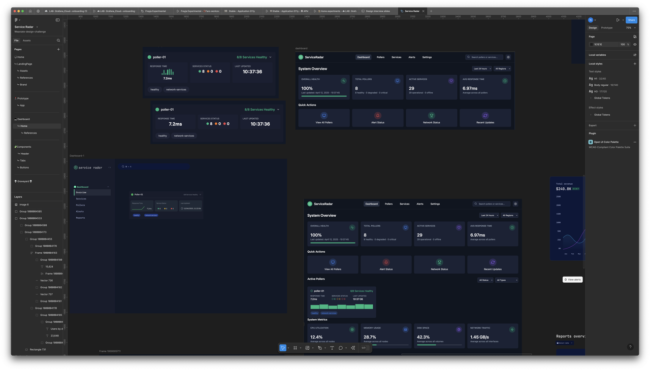
With the existing layout and basic element definition that Michael has implemented, I started to explore with quick wireframes explorations, focused on the parameters that I defined in the previous phases. During a project, starting with pen and paper ( sometimes on my ipad) allows me to very quickly and freely sketch out ideas without worrying about technical details or constraints.
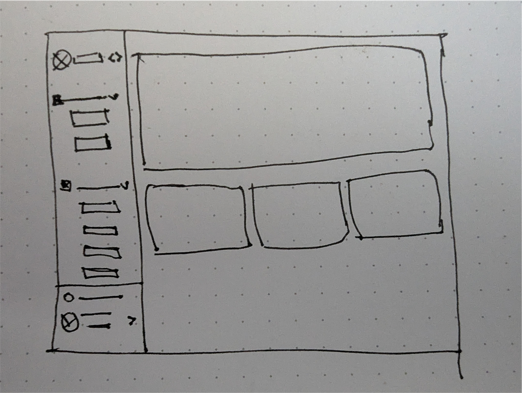
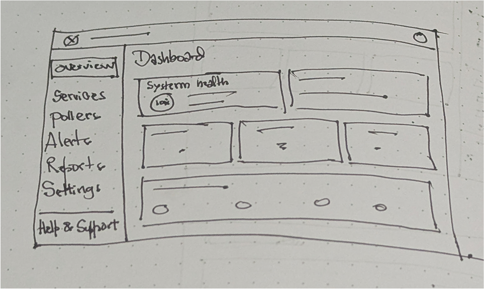
As my vision is clearer on the path to follow, I can transfer the explorations into figma and play with layouts and basic elements definition more clearly.
When I reach a stage I’m happy with the layout and elements, I can start to refine based on insights gained from the initial explorations. There are several considerations to keep in mind when refining the dashboard:
- Consistency: Ensure that the layout and elements are consistent across all screens and devices.
- Accessibility: Make sure that the dashboard is accessible to users with disabilities.
- Performance: Optimize the dashboard for performance to ensure that it loads quickly and runs smoothly.
- Responsiveness: Ensure that the dashboard is responsive and adapts to different screen sizes and devices.
- Usability: Make sure that the dashboard is easy to use and understand.
As the project is in very early stages, the style guide is still being developed and refined. However, some key elements to consider include:
- Color scheme: Choose a color palette that is visually appealing and easy to read.
- Typography: Select a font that is easy to read and matches the overall style of the dashboard.
- Icons: Use icons to represent different actions and features in the dashboard.
- Layout: Organize the dashboard in a way that makes it easy to navigate and understand.
Find the prototype app built in React here. Link