My passion lies at the intersection of product design and the collaborative spirit of open source. While I admire the community-driven nature and the ‘no guard rails’ innovation often found in open source projects, my experience working alongside talented engineers highlighted an observation: many contribute powerful code, but dedicated design contributors seemed less common within my professional network. Seeing this gap as an opportunity, I set a personal goal: to become a designer actively contributing to an open source project.
Driven by this goal, I began searching platforms like GitHub, Lemmy, and Reddit for a project that resonated with my interests and where design could potentially add significant value. My search led me to Service Radar, introduced via a Reddit post. As defined by its creator, Michael
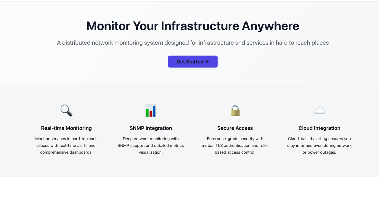
ServiceRadar is a distributed network monitoring system designed to keep an eye on internal services while delivering cloud-based alerting. It aims to tackle the complexities of modern infrastructure monitoring.

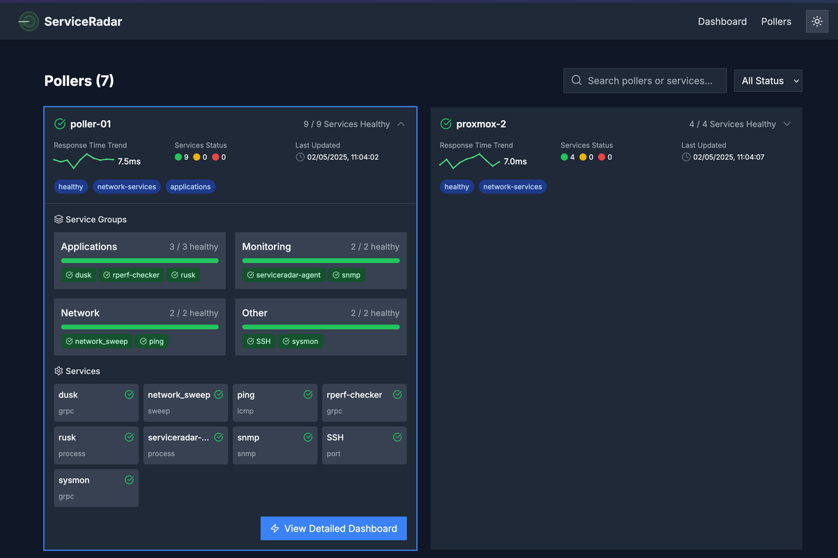
Intrigued by the project’s ambition, I explored the documentation and experimented with the current iteration. While functionally promising, my initial analysis suggested opportunities to enhance the user experience – particularly around the clarity of information presented and the ease with which new users could understand their system’s status at a glance.
Before reaching out formally, I wanted to ensure I understood the project’s context more deeply. I formulated key questions focusing on the specific target audience beyond DevOps/SREs, the competitive landscape, the long-term vision for Service Radar, and any existing design guidelines or branding. Understanding these elements, alongside how my skills (in design, plus HTML/CSS/JS) could best integrate, felt crucial for a meaningful contribution.
With these points prepared, I contacted Michael. Our initial chat was insightful; I learned more about his vision for Service Radar and confirmed that he hadn’t collaborated closely with a dedicated designer before, presenting a learning opportunity for both of us. I shared my initial observations and a preliminary UX audit, outlining concrete ways design thinking could support the project’s development.
Michael was receptive to the potential impact of integrating a design perspective. After discussing the possibilities based on my initial findings, we agreed that focusing first on improving the clarity and usability of the main status dashboard and visual hierarchy of critical alerts would be a valuable and impactful starting point. This marked the beginning of our collaboration and my journey as a product designer contributing to Service Radar.
First steps
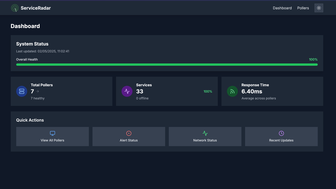
Picking up from our agreement, the immediate goal was to enhance the landing page clarity and usability of the main status dashboard. Addressing these became the primary focus for this phase.
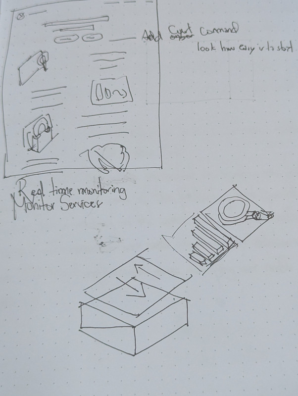
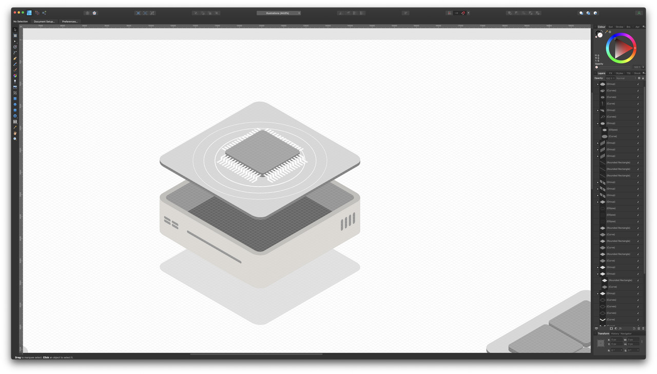
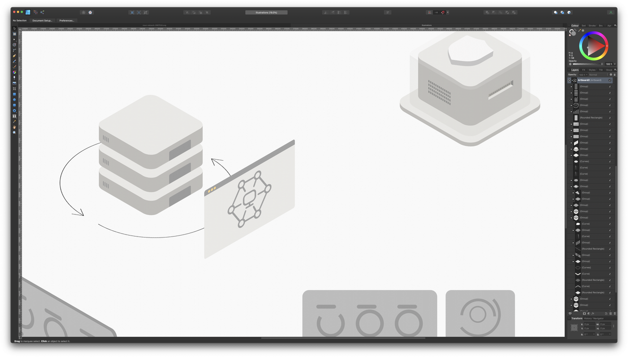
To tackle these challenges, I began exploring design directions aimed at presenting potentially complex monitoring information more intuitively. Seeking to effectively tie together data points and visual indicators, I researched visual styles prevalent in modern SaaS and technical dashboards, looking for approaches that emphasized clarity and scannability. An isometric style emerged as a promising direction, potentially offering a way to visually distinguish different monitored services or system components clearly within the dashboard interface.
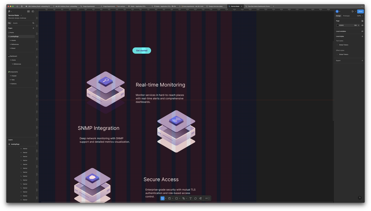
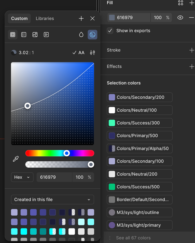
Throughout this visual exploration, accessibility was a core principle, not an afterthought. As I experimented with layouts and potential color palettes inspired by the isometric approach, I actively used Figma’s built-in tools to ensure adherence to WCAG contrast requirements. The goal was to create a visually engaging and universally usable interface from the outset.
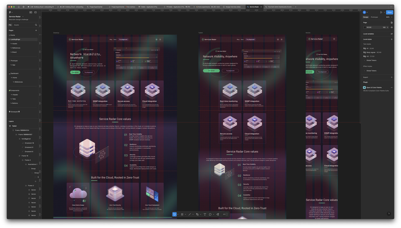
Based on this direction, I developed initial mockups of the revised webpage. These weren’t final designs but starting points for discussion and refinement. Through an iterative process, I shared these concepts with Michael, gathering his feedback on how effectively the new layouts surfaced critical information compared to the existing setup. This collaborative loop allowed us to quickly pinpoint areas for improvement and refine the visual language and information hierarchy. To ensure the proposed solution would function effectively across different user environments, I also developed responsive designs, considering layouts for three key breakpoints (desktop, tablet, and mobile).
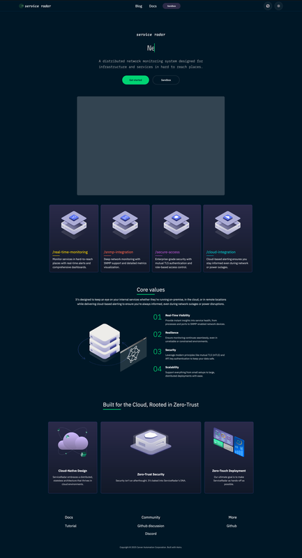
This iterative design and feedback cycle brought us closer to a concept that we believe significantly improves upon the previous version in terms of usability and clarity. The next logical step involves translating these refined designs into functional code.
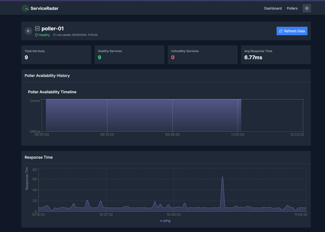
My work in progress of a coded version.