Ask what they came to do,then bring the docs to them.
About the landing
Chapter 03
Every path endssomewhere real.
QuestionChapter 01 · Notes
The findingNew users didn’t know what the products were for.01
In 2022 Grafana Cloud kept adding products, and research kept showing the same thing. The people who needed the docs most were the ones who never opened them.
The decisionAnswer the question before asking anything.02
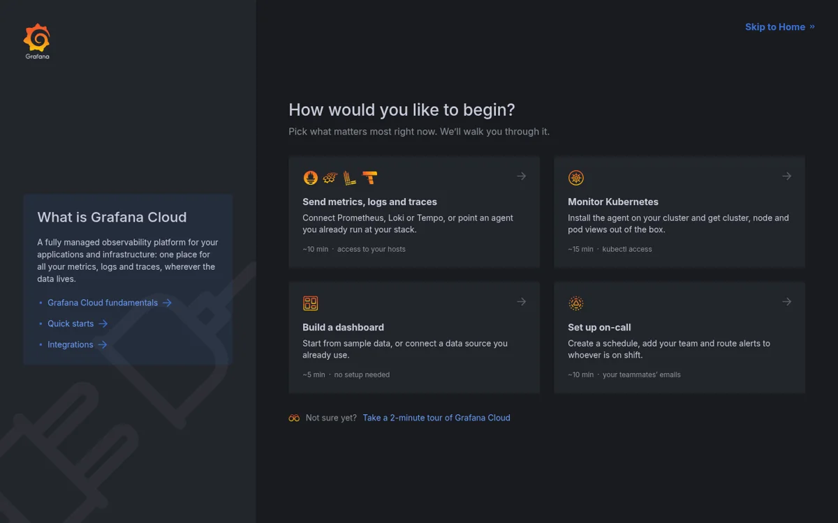
The welcome screen does one job: explain what Grafana Cloud is, in five lines and one picture.
The craftI drew the illustration from scratch.03
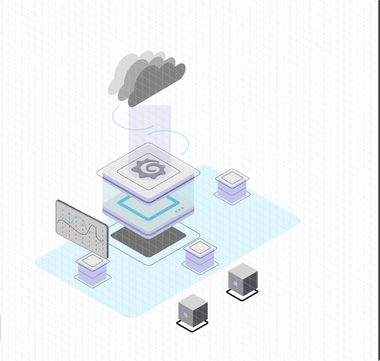
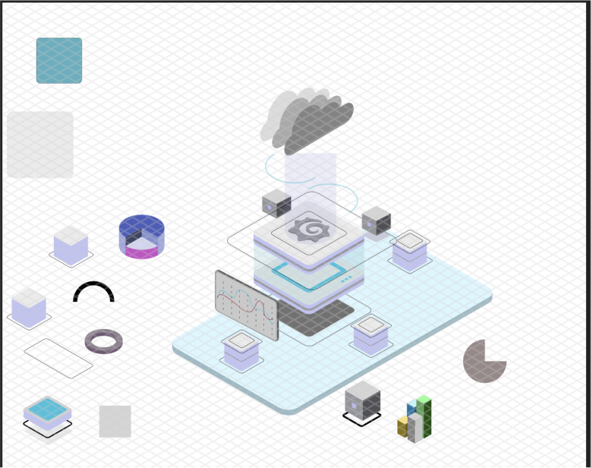
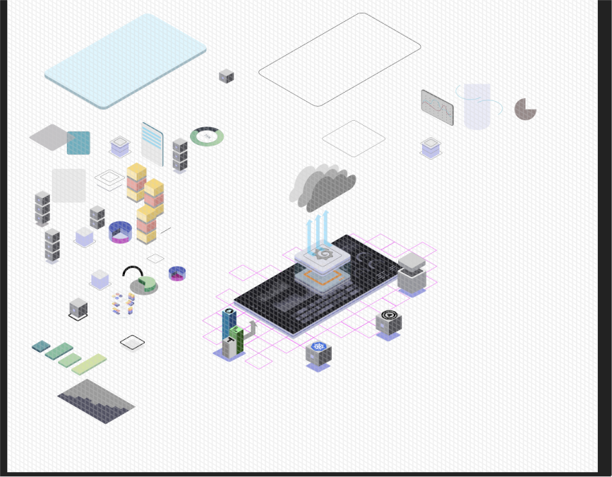
The Grafana core, the cloud above it, and one object for each part of the platform, so the answer is visible before it’s read.
SetupChapter 02 · Notes
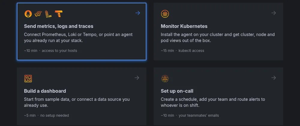
The decisionGoals, not product names.01
Send metrics, monitor Kubernetes, build a dashboard, set up on-call. A new user knows what they want to do long before they know what Tempo is.
The decisionThe docs come to them.02
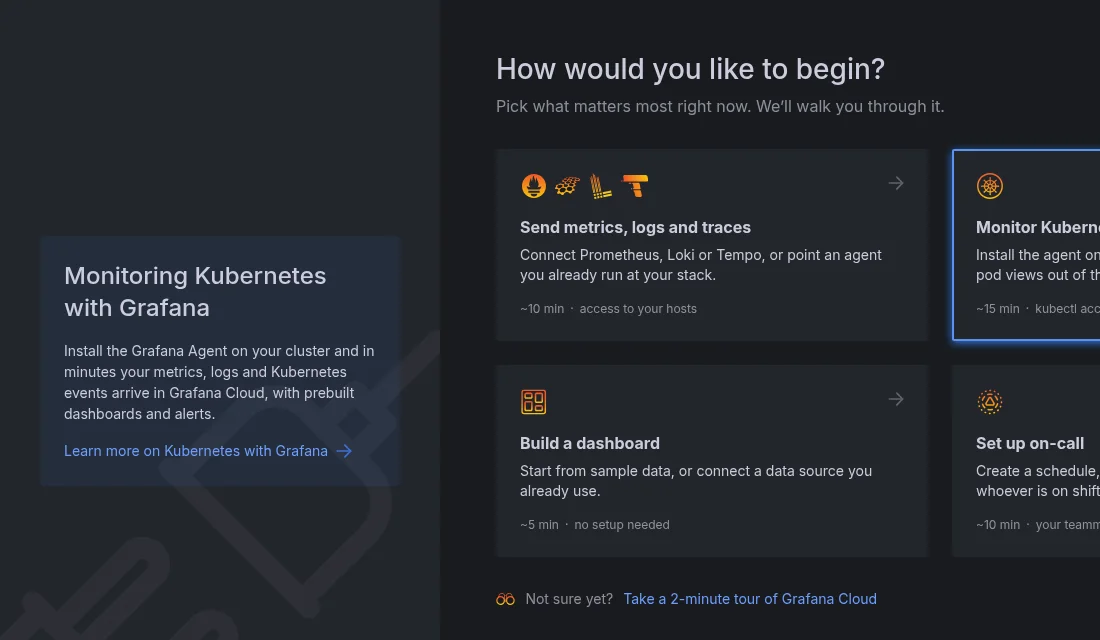
Point at a path and the panel explains it, with a link for anyone who wants more. No new tab, no digging.
The detailEvery path says what it takes.03
Time and access up front, so nobody starts something they can’t finish.
LandingChapter 03 · Notes
The decisionA short confirmation, then the real page.01
No dead end: every path lands on the product page it was about, with the next step ready.
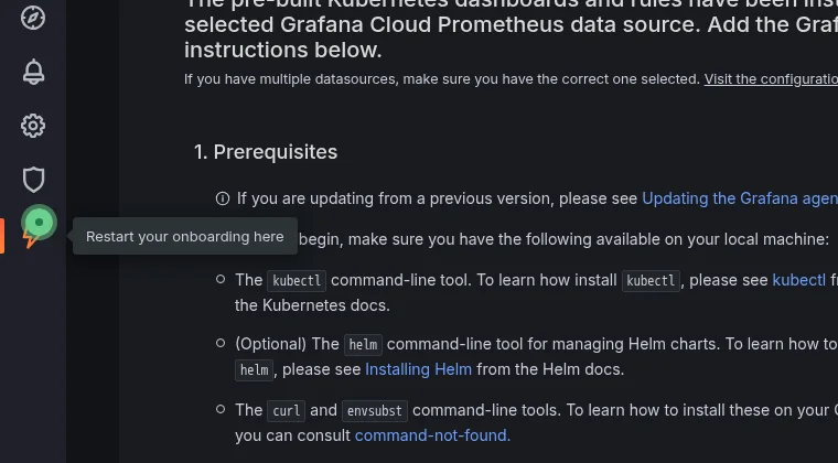
The detailOnboarding stays findable.02
The menu entry pulses, so people know where onboarding lives when they want it again.
The findingNew users didn’t know what the products were for.
In 2022 Grafana Cloud kept adding products, and research kept showing the same thing. The people who needed the docs most were the ones who never opened them.
The decisionAnswer the question before asking anything.
The welcome screen does one job: explain what Grafana Cloud is, in five lines and one picture.
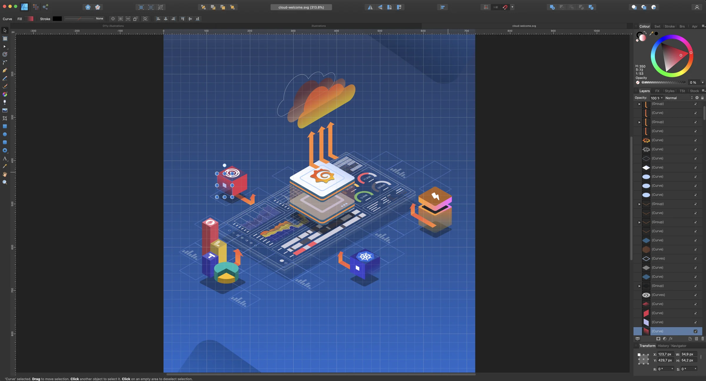
The craftI drew the illustration from scratch.
The Grafana core, the cloud above it, and one object for each part of the platform, so the answer is visible before it’s read.
About setup · Chapter 02
Ask what they came to do, then bring the docs to them.
grafana.com/cloud
The decisionGoals, not product names.
Send metrics, monitor Kubernetes, build a dashboard, set up on-call. A new user knows what they want to do long before they know what Tempo is.
The decisionThe docs come to them.
Point at a path and the panel explains it, with a link for anyone who wants more. No new tab, no digging.
The detailEvery path says what it takes.
Time and access up front, so nobody starts something they can’t finish.
About the landing · Chapter 03
Every path ends somewhere real.
grafana.com/cloud
The decisionA short confirmation, then the real page.
No dead end: every path lands on the product page it was about, with the next step ready.
The detailOnboarding stays findable.
The menu entry pulses, so people know where onboarding lives when they want it again.
What shipped
The first ten minutes, rebuilt.
By rethinking the first ten minutes, we lowered the barrier of entry for new users, especially non-technical ones.
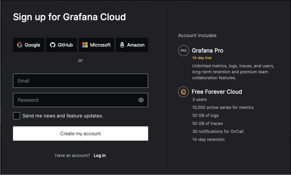
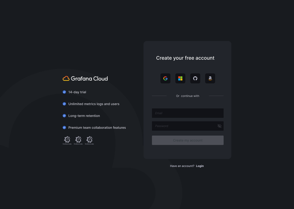
LoginA login screen that introduces the product
WelcomeA welcome screen built around “What is Grafana Cloud?”
SetupDoc snippets inside each setup step
TutorialsInteractive tutorials and tooltips
How I got thereResearch, iterations, the login, the illustration
The approach
The critical outcome from our team workshops was the idea to visually answer: “What is Grafana Cloud?”
Integrate documentationConcise, relevant doc snippets inside each onboarding step.
Visual communicationClear pictures of complex products, so abstract ideas become tangible.
Progressive disclosureComplexity arrives gradually: deeper docs when the user is ready, not forced.
Interactive learningHands-on tutorials and contextual tooltips instead of passive reading.
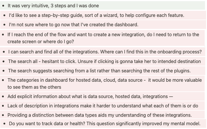
What users told us
User feedback highlighting confusion with product offerings
The login starts answering too
BeforeAfter
Welcome screen iterations
Initial exploration focusing on product ecosystem visualizationIteration emphasizing clear navigation paths and product discoveryFinal version with balanced information hierarchy and visual clarity
The illustration
Drawn from scratch in Affinity Designer: the Grafana core with the cloud above it and one object for each part of the platform around it.